Data Observability in Practice Using SQL

In this article series, we walk through how you can create your own data observability monitors from scratch, mapping to five key pillars of data health. Part 1 of this series was adapted from Barr Moses and Ryan Kearns’ O’Reilly training, Managing Data Downtime: Applying Observability to Your Data Pipelines, the industry’s first-ever course on data observability. The associated exercises are available here, and the adapted code shown in this article is available here.
From null values and duplicate rows, to modeling errors and schema changes, data can break for many reasons. Data testing is often our first line of defense against bad data, but what happens if data breaks during its life cycle?
We call this phenomenon data downtime, and it refers to periods of time where data is missing, erroneous, or otherwise inaccurate. Data downtime prompts us to ask questions such as:
- Is the data up to date?
- Is the data complete?
- Are fields within expected ranges?
- Is the null rate higher or lower than it should be?
- Has the schema changed?
To trigger an alert when data breaks and prevent data downtime, data teams can leverage a tried and true tactic from our friends in software engineering: monitoring and observability.
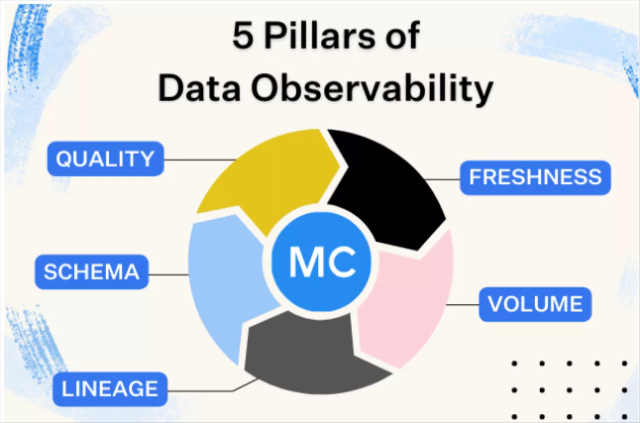
We define data observability as an organization’s ability to answer these questions and assess the health of their data ecosystem. Reflecting key variables of data health, the five pillars of data observability are:
- Freshness: is my data up to date? Are there gaps in time where my data has not been updated?
- Distribution: how healthy is my data at the field-level? Is my data within expected ranges?
- Volume: is my data intake meeting expected thresholds?
- Schema: has the formal structure of my data management system changed?
- Lineage: if some of my data is down, what is affected upstream and downstream? How do my data sources depend on one another?
It’s one thing to talk about data observability in this conceptual way, but a complete treatment should pull back the curtain — what does data observability actually look like, under the hood, in the code?
It’s difficult to answer this question entirely, since the details will depend on one’s choice of data lake vs data warehouse, BI tools, preferred languages and frameworks, and so on. Even so, addressing these problems using lightweight tools like SQLite and Jupyter could be useful.
In this article, we walk through an example data ecosystem to create our own data quality monitors in SQL and explore what data observability looks like in practice.
Let’s take a look.
Data Observability in practice
This tutorial is based on Exercises 1 of our O’Reilly course, Managing Data Downtime. You’re welcome to try out these exercises on your own using a Jupyter Notebook and SQL. We’ll be going into more detail, including exercises 2, 3 and 4, in future articles.
Our sample data ecosystem uses mock astronomical data about habitable exoplanets. For the purpose of this exercise, I generated the dataset with Python, modeling anomalies off of real incidents I’ve come across in production environments. This dataset is entirely free to use, and the utils folder in the repository contains the code that generated the data, if you’re interested.
I’m using SQLite 3.32.3, which should make the database accessible from either the command prompt or SQL files with minimal setup. The concepts extend to really any query language, and these implementations can be extended to MySQL, Snowflake, and other database environments with minimal changes.
A database entry in EXOPLANETS contains the following info:
0._id: A UUID corresponding to the planet.
1. distance: Distance from Earth, in lightyears.
2. g: Surface gravity as a multiple of g, the gravitational force constant.
3. orbital_period: Length of a single orbital cycle in days.
4. avg_temp: Average surface temperature in degrees Kelvin.
5. date_added: The date our system discovered the planet and added it automatically to our databases.
Note that one or more of distance, g, orbital_period, and avg_temp may be NULL for a given planet as a result of missing or erroneous data.
sqlite> SELECT * FROM EXOPLANETS LIMIT 5;
Note that this exercise is retroactive — we’re looking at historical data. In a production data environment, data observability is real time and applied at each stage of the data life cycle, and thus will involve a slightly different implementation than what is done here.
For the purpose of this exercise, we’ll be building data observability algorithms for freshness and distribution, but in future articles, we’ll address the rest of our five pillars — and more.
Freshness
The first pillar of data observability we monitor for is freshness, which can give us a strong indicator of when critical data assets were last updated. If a report that is regularly updated on the hour suddenly looks very stale, this type of anomaly should give us a strong indication that something is off.
First, note the DATE_ADDED column. SQL doesn’t store metadata on when individual records are added. So, to visualize freshness in this retroactive setting, we need to track that information ourselves.
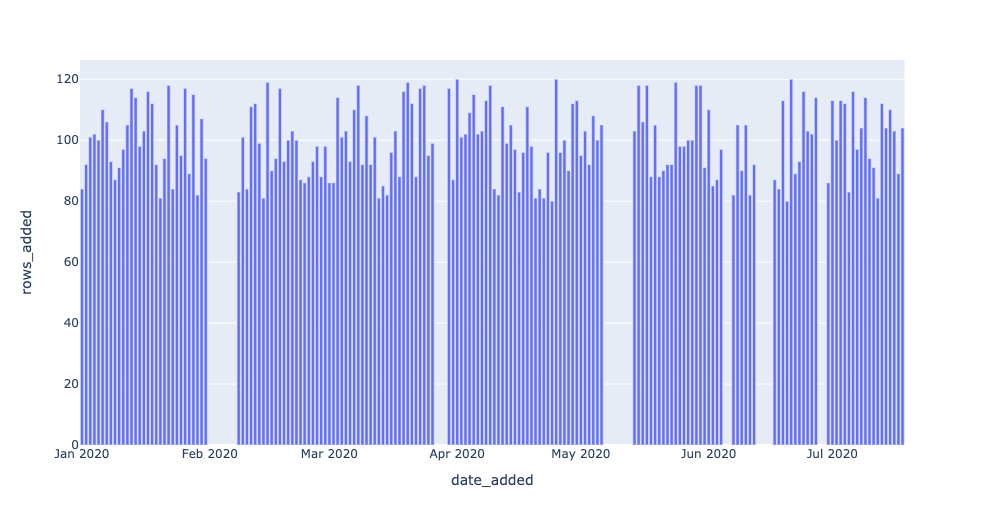
Grouping by the DATE_ADDED column can give us insight into how EXOPLANETS updates daily. For example, we can query for the number of new IDs added per day:
You can run this yourself with $ sqlite3 EXOPLANETS.db < queries/freshness/rows-added.sql in the repository. We get the following data back:
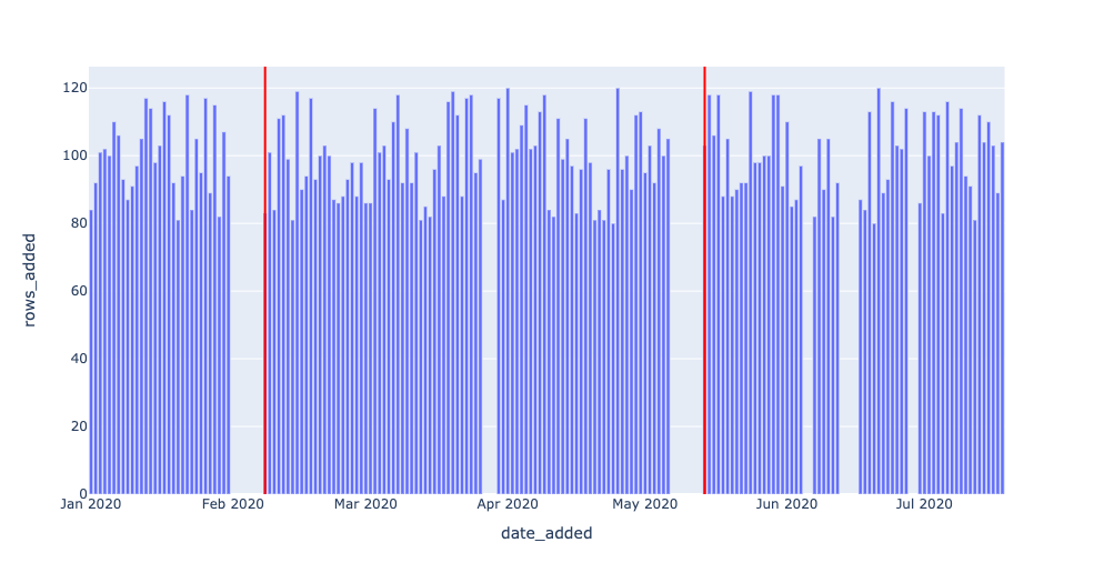
Based on this graphical representation of our dataset, it looks like EXOPLANETS consistently updates with around 100 new entries each day, though there are gaps where no data comes in for multiple days.
Recall that with freshness, we want to ask the question “is my data up to date?” — thus, knowing about those gaps in table updates is essential to understanding the reliability of our data.
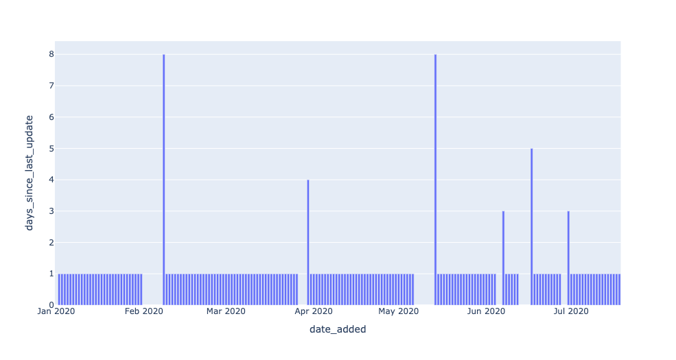
This query operationalizes freshness by introducing a metric for DAYS_SINCE_LAST_UPDATE. (Note: since this tutorial uses SQLite3, the SQL syntax for calculating time differences will be different in MySQL, Snowflake, and other environments).
The resulting table says “on date X, the most recent data in EXOPLANETS was Y days old.” This is information not explicitly available from the DATE_ADDED column in the table — but applying data observability gives us the tools to uncover it.
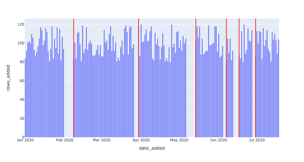
Now, we have the data we need to detect freshness anomalies. All that’s left to do is to set a threshold parameter for Y — how many days old is too many? A parameter turns a query into a detector, since it decides what counts as anomalous (read: worth alerting) and what doesn’t. (More on setting threshold parameters in a later article!).
The data returned to us represents dates where freshness incidents occurred.
On 2020–05–14, the most recent data in the table was 8 days old! Such an outage may represent a breakage in our data pipeline, and would be good to know about if we’re using this data for anything worthwhile (and if we’re using this in a production environment, chances are, we are).
Note in particular the last line of the query: DAYS_SINCE_LAST_UPDATE > 1;.
Here, 1 is a model parameter — there’s nothing “correct” about this number, though changing it will impact what dates we consider to be incidents. The smaller the number, the more genuine anomalies we’ll catch (high recall), but chances are, several of these “anomalies” will not reflect real outages. The larger the number, the greater the likelihood all anomalies we catch will reflect true anomalies (high precision), but it’s possible we may miss some.
For the purpose of this example, we could change 1 to 7 and thus only catch the two worst outages on 2020–02–08 and 2020–05–14. Any choice here will reflect the particular use case and objectives, and is an important balance to strike that comes up again and again when applying data observability at scale to production environments.
Below, we leverage the same freshness detector, but with DAYS_SINCE_LAST_UPDATE > 3; serving as the threshold. Two of the smaller outages now go undetected.

Now, we visualize the same freshness detector, but with DAYS_SINCE_LAST_UPDATE > 7; now serving as the threshold. All but the two largest outages now go undetected.
Just like planets, optimal model parameters sit in a “Goldilocks Zone” or “sweet spot” between values considered too low and too high. These data observability concepts (and more!) will be discussed in a later article.
Distribution
Next, we want to assess the field-level, distributional health of our data. Distribution tells us all of the expected values of our data, as well as how frequently each value occurs. One of the simplest questions is, “how often is my data NULL”? In many cases, some level of incomplete data is acceptable — but if a 10% null rate turns into 90%, we’ll want to know.
This query returns a lot of data! What’s going on?
The general formula CAST(SUM(CASE WHEN SOME_METRIC IS NULL THEN 1 ELSE 0 END) AS FLOAT) / COUNT(*), when grouped by the DATE_ADDED column, is telling us the rate of NULL values for SOME_METRIC in the daily batches of new data in EXOPLANETS. It’s hard to get a sense by looking at the raw output, but a visual can help illuminate this anomaly:
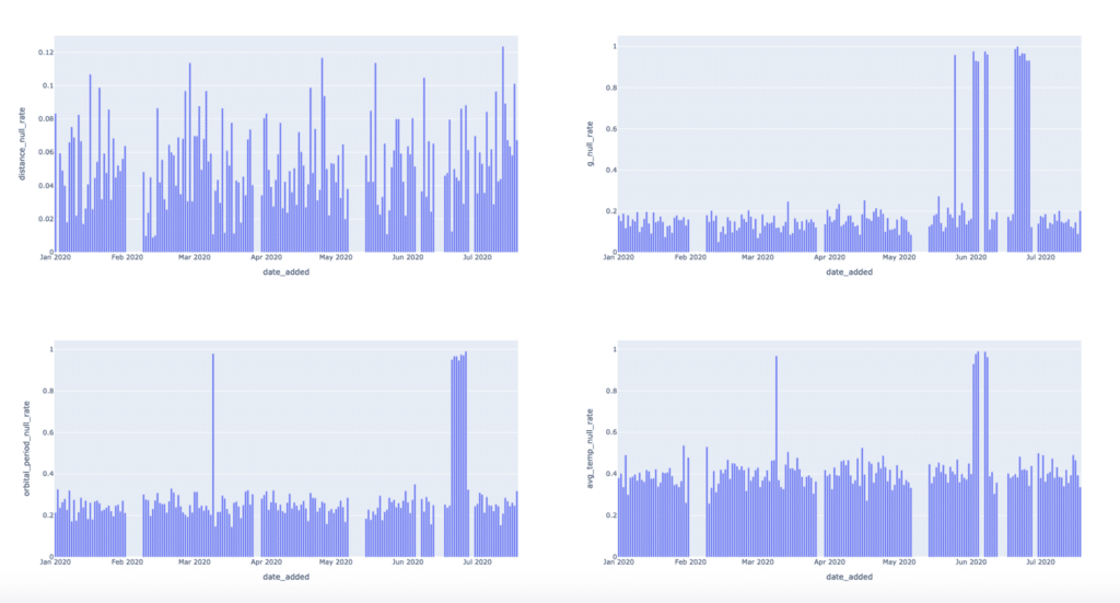
The visuals make it clear that there are null rate “spike” events we should be detecting. Let’s focus on just the last metric, AVG_TEMP, for now. We can detect null spikes most basically with a simple threshold:
As detection algorithms go, this approach is something of a blunt instrument. Sometimes, patterns in our data will be simple enough for a threshold like this to do the trick. In other cases, though, data will be noisy or have other complications, like seasonality, requiring us to change our approach.
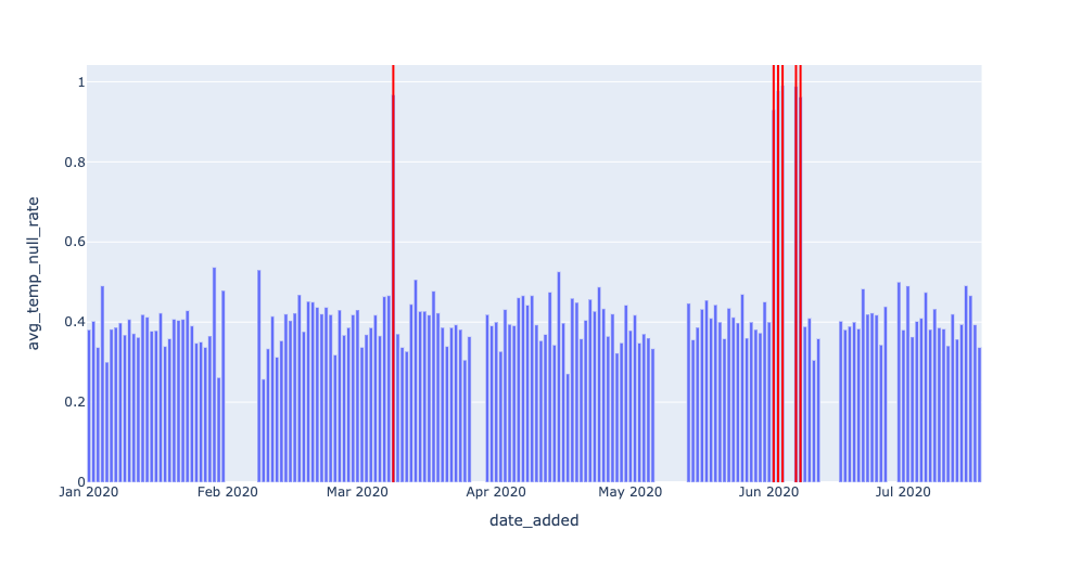
For example, detecting 2020–06–02, 2020–06–03, and 2020–06–04 seems redundant. We can filter out dates that occur immediately after other alerts:
Note that in both of these queries, the key parameter is 0.9. We’re effectively saying: “any null rate higher than 90% is a problem, and I need to know about it.”
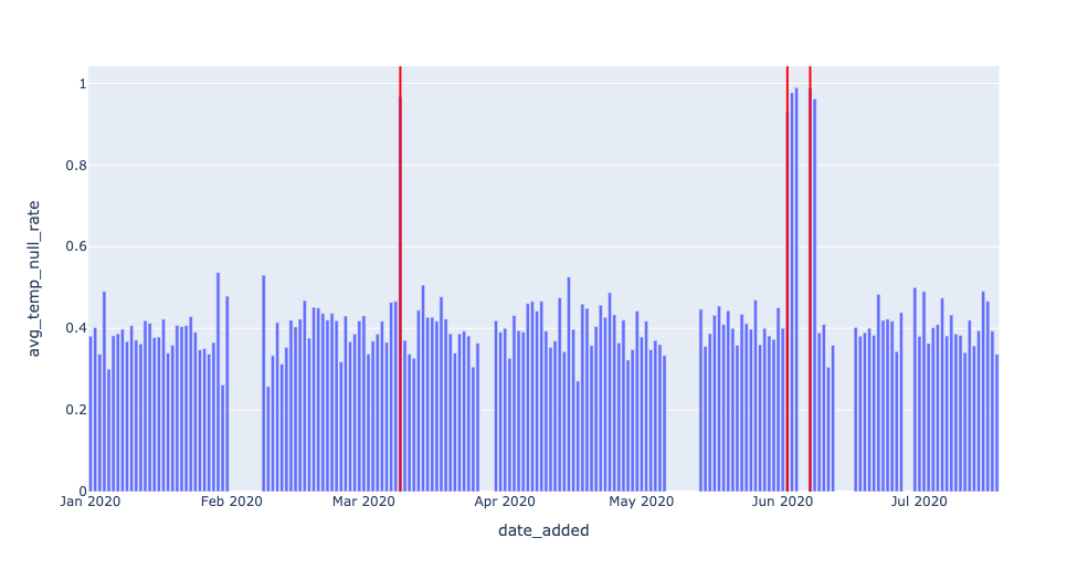
In this instance, we can (and should) be a bit more intelligent by applying the concept of rolling average with a more intelligent parameter:

One clarification: notice that on line 28, we filter using the quantity AVG_TEMP_NULL_RATE — TWO_WEEK_ROLLING_AVG. In other instances, we might want to take the ABS() of this error quantity, but not here — the reason being that a NULL rate “spike” is much more alarming if it represents an increase from the previous average. It may not be worthwhile to monitor whenever NULLs abruptly decrease in frequency, while the value in detecting a NULL rate increase is clear.
There are, of course, increasingly sophisticated metrics for anomaly detection like Z-scores and autoregressive modeling that are out of scope here. This tutorial just provides the basic scaffolding for field-health monitoring in SQL; I hope it can give you ideas for your own data!
What’s next?
This brief tutorial intends to show that “data observability” is not as mystical as the name suggests, and with a holistic approach to understanding your data health, you can ensure high data trust and reliability at every stage of your pipeline.
In fact, the core principles of data observability are achievable using plain SQL “detectors,” provided some key information like record timestamps and historical table metadata are kept. It’s also worth noting that key ML-powered parameter tuning is mandatory for end-to-end data observability systems that grow with your production environment.
Stay tuned for future articles in this series that focus on monitoring anomalies in distribution and schema, the role of lineage and metadata in data observability, and how to monitor these pillars together at scale to achieve more reliable data.
Until then — here’s wishing you no data downtime!
Interested in learning more about how to apply data observability at scale? Reach out to Ryan and book a time to speak with us using the form below.
Our promise: we will show you the product.
 Product demo.
  What is data observability?
  What is a data mesh--and how not to mesh it up
  The ULTIMATE Guide To Data Lineage
