 Product demo.
  3 Steps to AI-Ready Data
 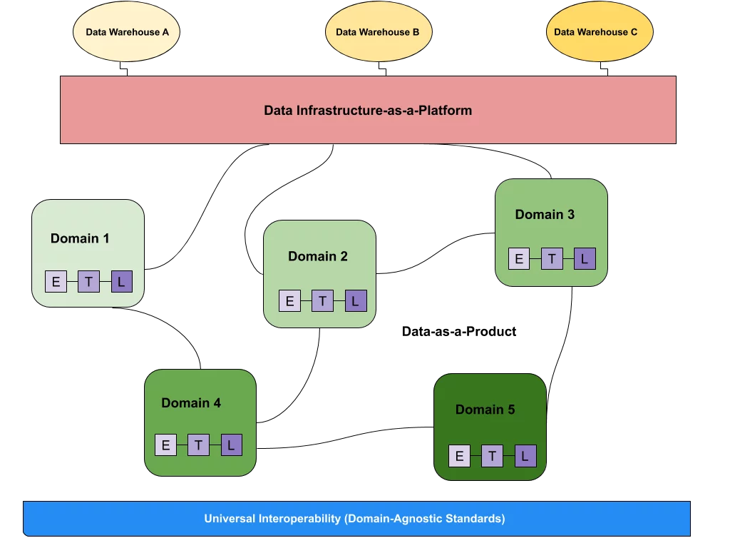 What is a data mesh--and how not to mesh it up
 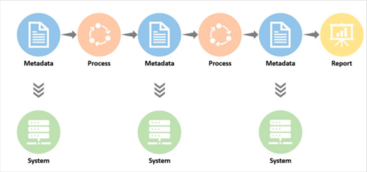 The ULTIMATE Guide To Data Lineage
 Just Launched: Data Operations Dashboard Advances Data Quality Initiatives at Scale

It’s not easy to track the progress of your data quality initiatives under the simplest circumstances.
It’s 100x harder when your data environment is fragmented.
From siloed platforms to distributed teams and knowledge gaps, it becomes unwieldy at best to answer even the most common questions, like:
- How quickly are we responding to alerts?
- How many incidents did we have?
- How serious were they?
- How quickly are we resolving them?
- How are we tracking towards meeting our data quality KPIs?
Measuring performance is the first step to inspiring change. That’s why we created the new Data Operations Dashboard.
With the Data Product Dashboard, you can see real-time metrics for all of your critical data products to understand at-a-glance what’s working, where there are data quality gaps, and how you’re tracking toward your OKRs.
Keep reading to get all the details, or schedule a demo to see it live.
Driving data quality success with the Data Operations Dashboard
When it comes to your data quality strategy – like most things in life – you can’t manage what you don’t measure.
Facilitating the adoption of governance protocols is impossible without a system to measure performance. Or to say it another way, you’ll never be able to standardize processes and performance across disparate teams until you can easily wrangle metrics. Unfortunately, when you’re on the hook for data quality transformation today, finding a solution to measurement silos isn’t a challenge that comes with the luxury of time.
At its most basic, the Data Operations Dashboard provides a look at team operational metrics over the last 12 months. Among the metrics this dashboard can track, data teams can visualize:
- Response time for monitor alerts—median time to update a status
- Resolution time for alerts classified as incidents—median time to mark as resolved
- Total # of severe incidents and the owners responsible
In other words, the Data Operations Dashboard will give data teams scannable data about where incidents are happening, how long they’re persisting, and how well incidents owners are doing at managing the incidents in their own purview for mission critical products and priorities.
Metrics are only as good as how you can use them, and there are a few key ways you can leverage Data Operations Dashboard, including:

- Identifying hotspots for recurring incidents
- Diagnosing soft spots in process adoption
- Prioritizing initiatives or domains for additional improvements
- Tracking multiple teams and their performance against specified incident management standards or OKRs
With the Data Operations Dashboard, data leaders are empowered to bring their data quality and governance strategies to life by effortlessly tracking multiple teams at once against approved incident management standards—and then tying that performance back to a data quality initiative to hold each and every team accountable for its success.
Now that we know what it is, and what it does, let’s take a look at how to set up your Data Operations Dashboard in Monte Carlo.
How to get started
If you’re familiar with creating dashboards in Monte Carlo, setting up your Data Operations Dashboard should be a pretty easy experience.
Within your Monte Carlo account, simply use the Add filter or Create dashboard action button to add filters to your data operations dashboard. Dashboards can be filtered by any of the taxonomies available in Monte Carlo.
The following allow for filtering alerts and incidents by a set of tables:
The following allow for filtering alerts and incidents by a set of tables or set of monitors:
To track distributed teams, dashboards can easily be created for each domain or several with a common theme. This allows data leaders to understand where performance issues are hiding and how well their teams are doing at addressing data quality issues across domains.
Tags can also be used to organize and classify assets within MC—and existing tags can easily be imported from source systems—to segment assets by business unit, warehouse or discipline.
To leverage the Data Operations Dashboard most effectively, we recommend reviewing these metrics for your team on a monthly cadence, but teams may choose to review weekly or even quarterly depending on their needs or SLAs.
For more information, check out our docs.
Operationalize data quality at scale with data observability
When it comes to bringing your data quality strategy to life, automating metrics tracking is the first step to achieving success at scale.
But the Data Operations Dashboard is just one step toward operational excellence. At Monte Carlo, we’re charting the path toward more reliable data at any scale—and we’re releasing new data governance features every week to make that dream a reality.
If data quality is on your roadmap this year, contact the Monte Carlo team to find out how data observability can help take your next initiative from strategy to success.
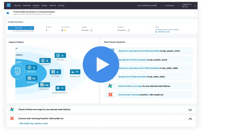
Our promise: we will show you the product.
Read more posts.