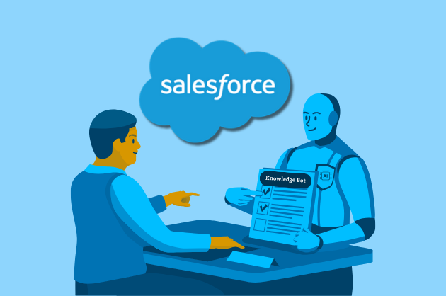
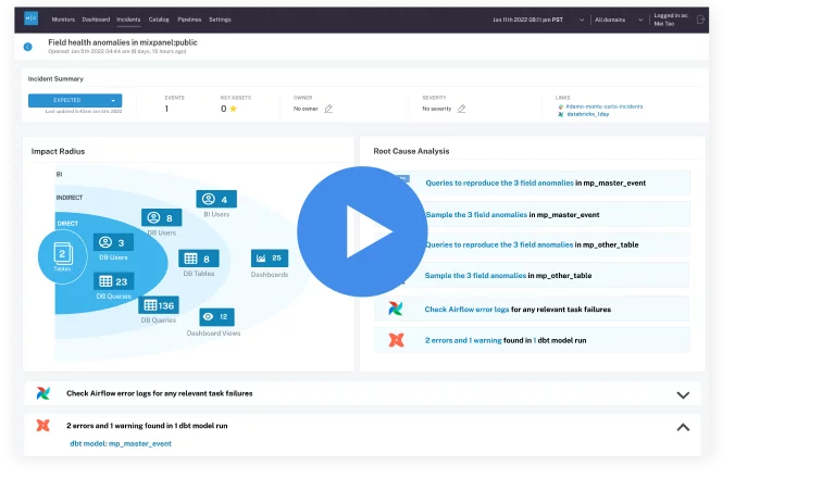
 Product demo.
  3 Steps to AI-Ready Data
 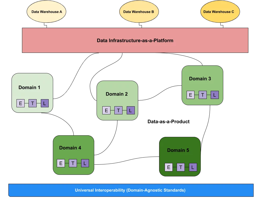 What is a data mesh--and how not to mesh it up
 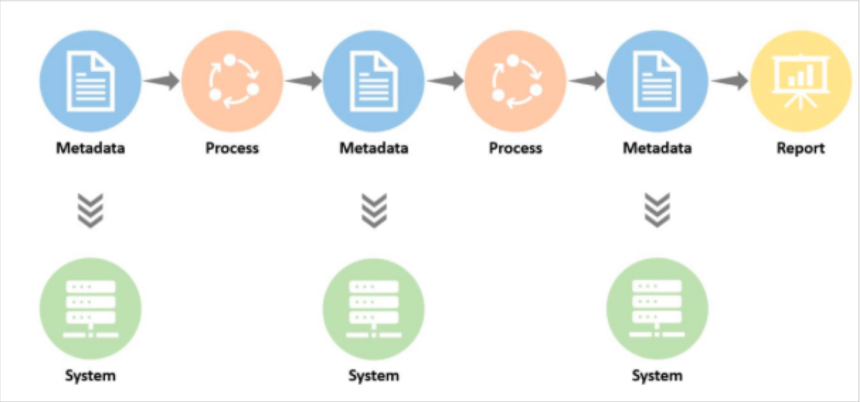 The ULTIMATE Guide To Data Lineage
 Most Data Quality Initiatives Fail Before They Start. Here’s Why.

Every day I talk to organizations ready to dedicate a tremendous amount of time and resources towards data quality initiatives doomed to fail.
It’s no revelation that incentives and KPIs drive good behavior. Sales compensation plans are scrutinized so closely that they often rise to the topic of board meetings. What if we gave the same attention to data quality scorecards?
Even in their heyday, traditional data quality scorecards from the Hadoop era were rarely wildly successful. I know this because prior to starting Monte Carlo, I spent years as an operations VP trying to create data quality standards that drove trust and adoption.

Over the past few years, advances in the cloud and metadata management have made organizing silly amounts of data possible. Data engineering processes are starting to trend towards the level of maturity and rigor of more longstanding engineering disciplines. And of course, AI has the potential to streamline everything.
While this problem isn’t – and probably will never be – completely solved, I have seen organizations adopt best practices that are the difference between initiative success…and having another kick-off meeting 12 months later.
Here are 4 key lessons for building data quality scorecards:
- Know what data matters
- Measure the machine
- Get your carrots and sticks right
- Automate evaluation and discovery
Know what data matters
The most sure way to fail any data related initiative is to assume all data is of equal value. And the best only way to determine what matters is to talk to the business.
Brandon Beidel at Red Ventures articulates a good place to start:
“I’d ask:
- How do you use this table?
- When do you look at this data? When do you report this data? Does this data need to be up to the minute, hourly, daily?
- What purpose does this serve?
- Who needs to get notified if this data is delayed?”
Now, this may be easier said than done if you work for a sprawling organization with tens of thousands of employees distributed across the globe.
In these cases, my recommendation is to start with your most business critical data business units (if you don’t know that, I can’t help you!). Start a discussion on requirements and priorities.
Just remember: prove the concept first, scale second. You’d be shocked how many people do it the other way around.
Measure the machine
One of the enduring challenges to this type of endeavor, in a nutshell, is data quality resists standardization. Quality is, and should be, in the eye of the beholder use case.
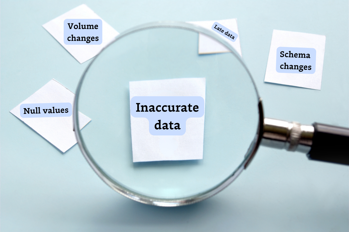
The six dimensions of data quality are a vital part of any data quality scorecard and an important starting point, but for many teams, that’s just the beginning – and every data product is different. For instance, a financial report may need to be highly accurate with some margin for timeliness whereas a machine learning model may be the exact opposite.
From an implementation perspective this means measuring data quality has typically been radically federated. Data quality is measured on a table-by-table basis by different analysts or stewards with wildly different data quality rules given wildly different weights.
This makes sense to a degree, but so much gets lost in translation. Data is multi-use and shared across use cases. Not only is one person’s “yellow” quality score another person’s “green,” but it’s often incredibly difficult for data consumers to even understand what a “yellow” score means or how it’s been graded. They also frequently miss the implications of a green table being fed data by a red one (you know, garbage in, garbage out…).

Surfacing the number of breached rules is important, of course, but you also need to:
- Contextualize it as much as possible,
- Have an aggregated end-to-end data product view,
- Invest in some strong no-code data profiling, and
- Realize it’s not sufficient.

So then what else do you need? You need to measure the machine.
In other words, the components in the production and delivery of data that generally result in high quality. This is much easier to standardize. It’s also easier to understand across business units and teams.
Airbnb Midas is one of the more well known internal data quality score and certification programs and rightfully so. They lean heavily into this concept. They measure data accuracy– but reliability, stewardship, and usability actually comprise 60% of the total score.
Many data teams are still in the process of formalize their own standards, but the components we have found to highly correlate to data health include:
- The previously mentioned six dimensions of data quality (validity, completeness, consistency, timeliness, uniqueness, accuracy).
- Usability & Stewardship: Typically via a data observability platform, data catalog solution, or both.
- Documentation: Some level of semantic meaning for both the data asset, its use, and past incidents. One online travel search company scores an asset based on how and where it’s cataloged along with the completeness of its metadata for two of its 6 categories.
- Lineage: Ability to trace the data’s provenance at the field level across systems.
- Usage: The number of queries a table receives and the number of data products with downstream dependencies. This can be a “key asset score” and it has a flywheel effect. You focus your reliability efforts on what’s most utilized, and people trust what’s popular.
- System Reliability: Typically via a data observability solution.
- Monitoring: Generally if a data product has strong coverage not only on the last mile table but all the way upstream, it indicates a well curated asset.
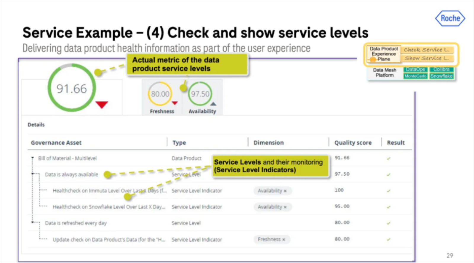
- Freshness: Data freshness requirements will vary by data product type, but it is a table level metric where deviations from the norm can be identified and surfaced. Many organizations like Roche Diagnostics will have specific freshness SLAs for their data products and measure the level of adherence.
- Volume: A relatively steady number of rows a table receives is often a sign of a well functioning pipeline and data delivery system.
- Schema: At the very least you want consumers to have visibility into schema changes. For your most critical pipelines, you ideally want some level of schema enforcement or data contract so that you know when changes at the source break assets downstream.
- Operational Response: Typically via a data observability solution.
- Ownership: Does an asset have an owner? Bonus for if it has both a technical and business owner.
- Notification Channels & Communication: Data delivery is a complex process involving multiple handoffs from ingestion to aggregation to consumption. On top of that, you ideally have multiple teams using a data asset (or else your mesh is more of a silo). The only way to have a reliable data product in this environment is to have a central communication channel to highlight and discuss changes and incidents.
- Average Time To Fixed: Arguably the most important indicator of how much you can trust a dataset is in how quickly the support team responds and fixes incidents that arise. Bad data is inevitable. Great incident response is intentional.

Get your carrots and sticks right
“Yay, another set of processes we’re required to follow!”… said no one ever.
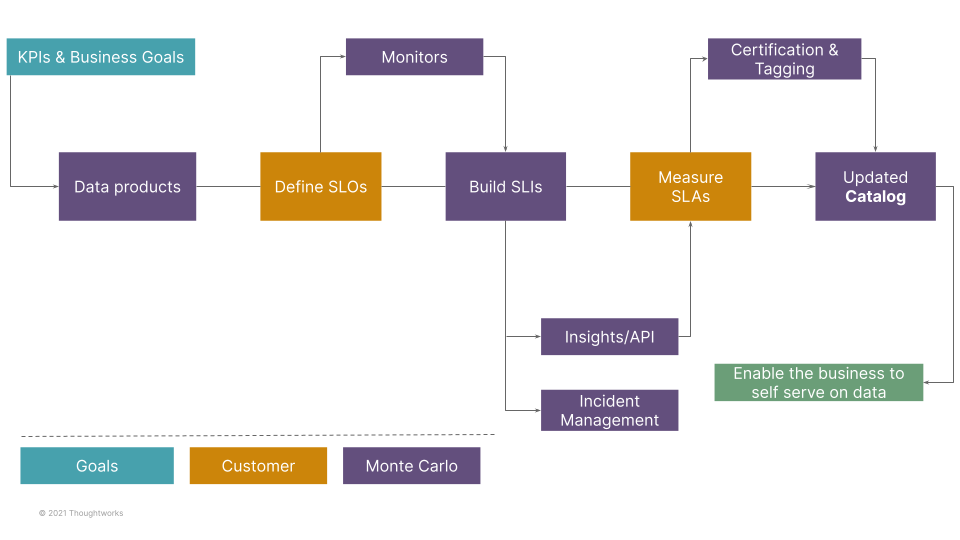
Remember the purpose of measuring data health isn’t to measure data health. The point, as Clark at Airbnb put it, is to “drive a preference for producing and using high quality data.”
The best practices I’ve seen here are to have a minimum set of requirements for data to be on-boarded onto the platform (stick) and a much more stringent set of requirements to be certified at each level (carrot).
Certification works as a carrot because producers actually want consumers to use their data, and consumers will quickly discern and develop a taste for highly reliable data.
And the best way to ensure requirements are met? Making data quality a self-serve process through data observability.

Data observability helps consumers and producers work towards building KPIs and SLAs around data quality, rolling them out, and holding the organization accountable.
For data consumers, data observability allows you to understand the reliability, accuracy, and usability of your data for generating insights and data products as measured by their data quality scores.
For data producers, these solutions help generate the score itself and in turn informs issue triaging and resolution. Unlike traditional approaches to data quality measurement, data observability takes it a step further and also allows data producers to easily improve their data quality scores via monitoring and root cause analysis, and to continuously report on them.
Automate evaluation and discovery
Almost nothing in data management is successful without some degree of automation and the ability to self-service. Airbnb discarded any scoring criteria that 1) wasn’t immediately understandable and 2) couldn’t be measured automatically.
Your organization must do the same. Even if it’s the best scoring criteria that has ever been conceived, if you do not have a set of solutions that will automatically collect and surface it, into the trash bin it must go.
The most common ways I’ve seen this done are with data observability and quality solutions, and data catalogs. Roche, for example, does this and layers on access management as part of creating, surfacing and governing trusted data products.
Of course this can also be done by manually stitching together the metadata from multiple data systems into a homegrown discoverability portal, but just be mindful of the maintenance overhead.
What’s measured is managed
Data teams have made big investments into their modern data and AI platforms. But to maximize this investment, the organization – both data producers and consumers – must fully adopt and trust the data being provided.
At the end of the day, what’s measured is managed. And isn’t that what matters?
To learn more about how you can build data quality scorecards – and deliver high quality data to your stakeholders – reach out to the Monte Carlo team.
Our promise: we will show you the product.
Read more posts.